Introduction
Student Technology Loan Program (STLP) is a student-run organization that loans electronics like cameras and laptops to students.
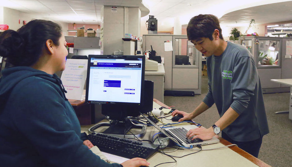
As a staff member, I regularly dealt with issues stemming from the poor web experience. This led me to start a redesign effort.
Goals
Starting the project, I got together a group of students and observed them completing tasks on the website. Afterwards, I talked to them about what they struggled with and their previous experiences.
I also talked to my managers and colleagues to understand what they wanted in the new website.
From there, I was able to identify goals to design for:
- Improve layout and ease of use, especially for mobile
- Make content concise and relevant
- Reduce volume of support calls and emails
- Help STLP secure more funding
1. Layout and Ease of Use
The old design was very mobile-hostile. It had multiple nav bars and relied heavily on menus that activated with mouse hovers (this doesn’t work on mobile!).
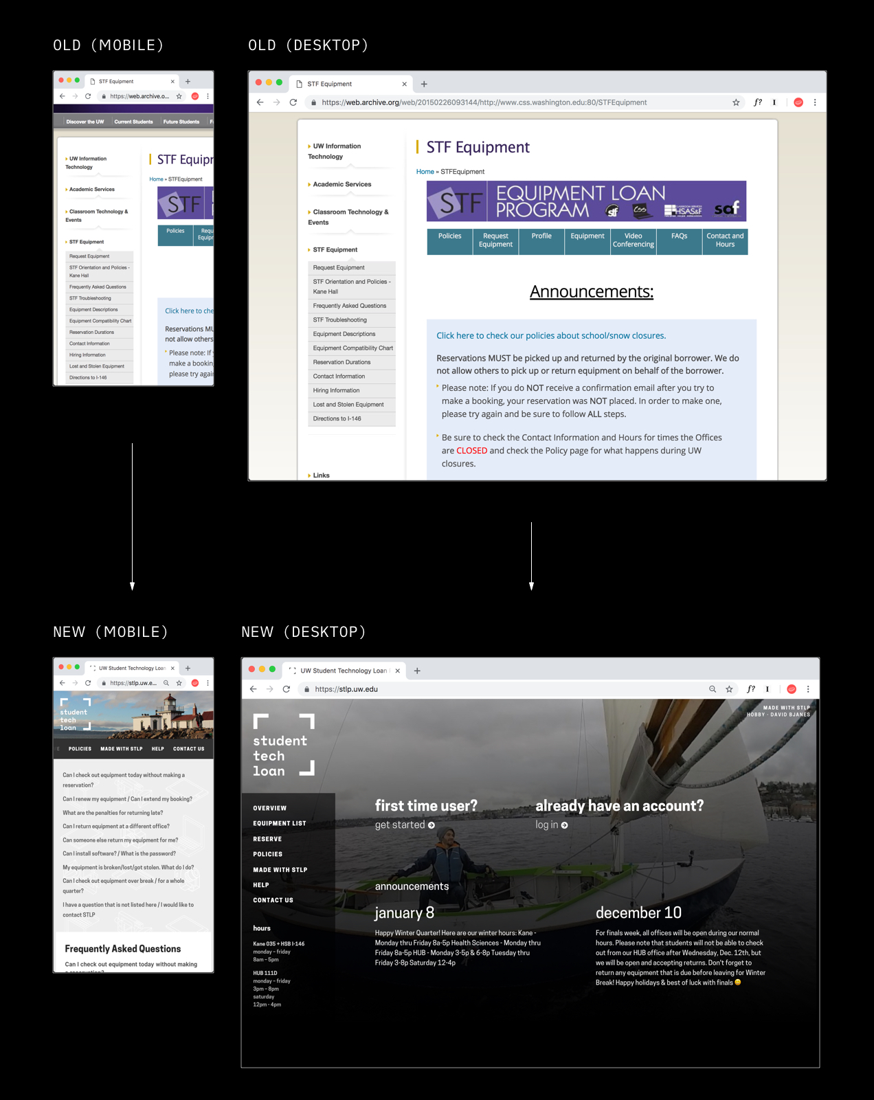
Since most of the students access the site on mobile, the new design had to be mobile-first.
For me, this meant designing a web experience that scales up, being very usable on small screens, while adapting elegantly to larger screens.
The visual design was also updated to be unified and more aesthetically pleasing. While it wasn’t the top priority, this sets a quality bar going forward.
2. Concise and Relevant Content
A good website should be a resource that provides students with information they need, while being as concise as possible.
Over the years, the site became populated with more and more text under the assumption that people would read them. People did not read, and students couldn’t find the information they needed.
This led to very high volumes of emails and phone calls because contacting support became easier than finding the info themselves.
We needed to get to a place where it is easier to find the information/answers they need than it is to send an email or start a phone call. With walls of irrelevant text, that wasn’t the case.
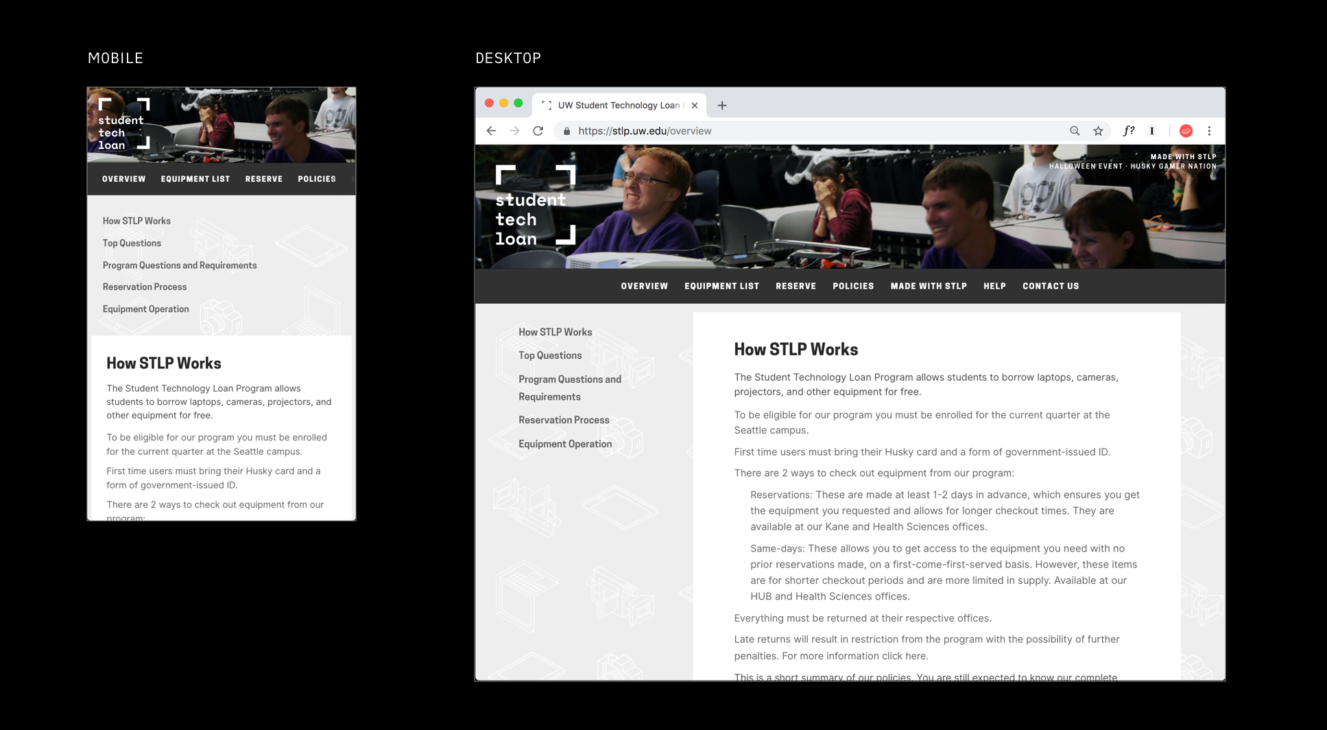
This meant re-writing all the text on the website around 2 key goals: being concise and relevant.
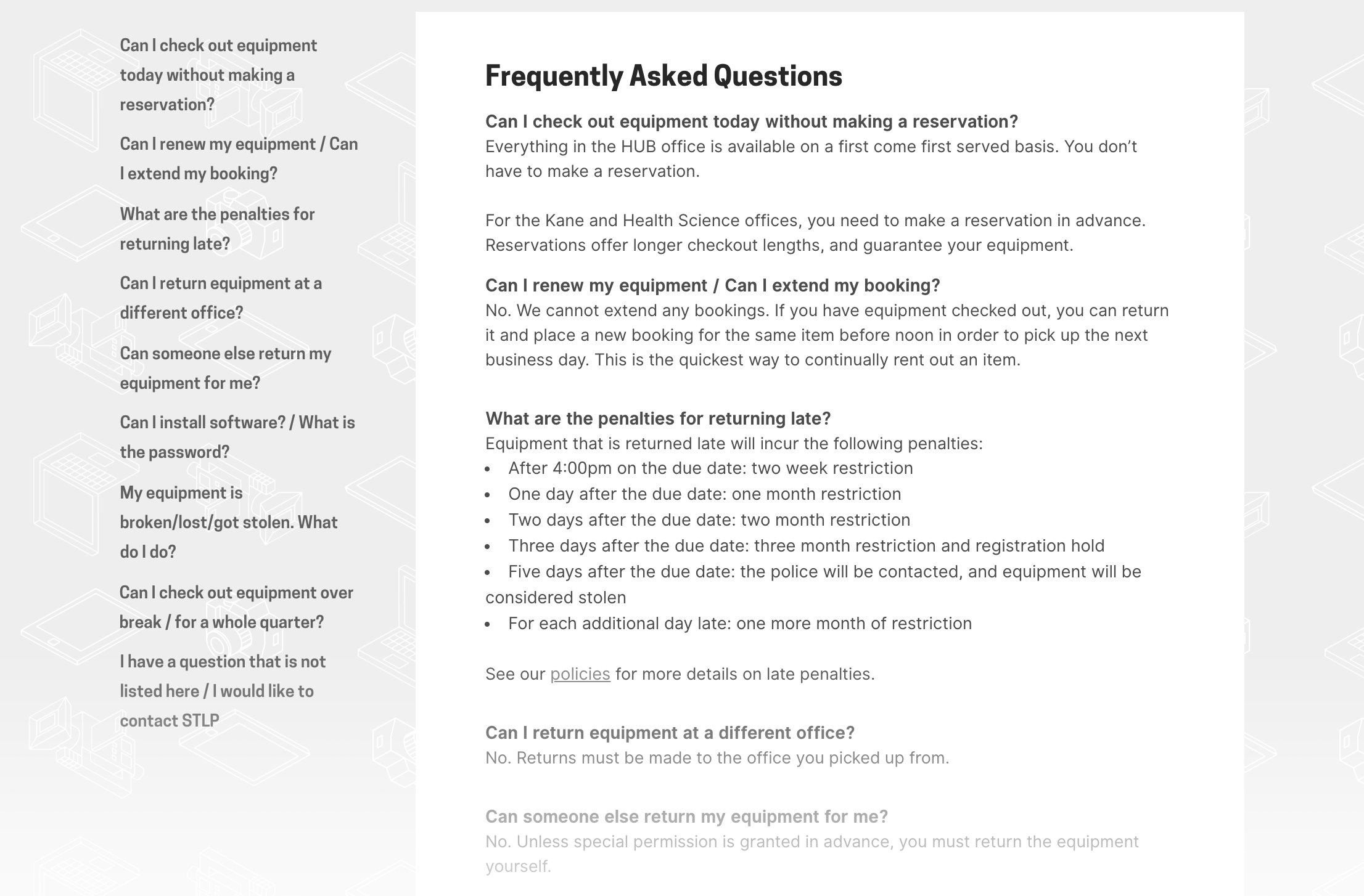
Students mostly have the same questions or are looking for the same information. So we created a FAQ page as a central place students can go and immediately get answers without having to dig through the site.
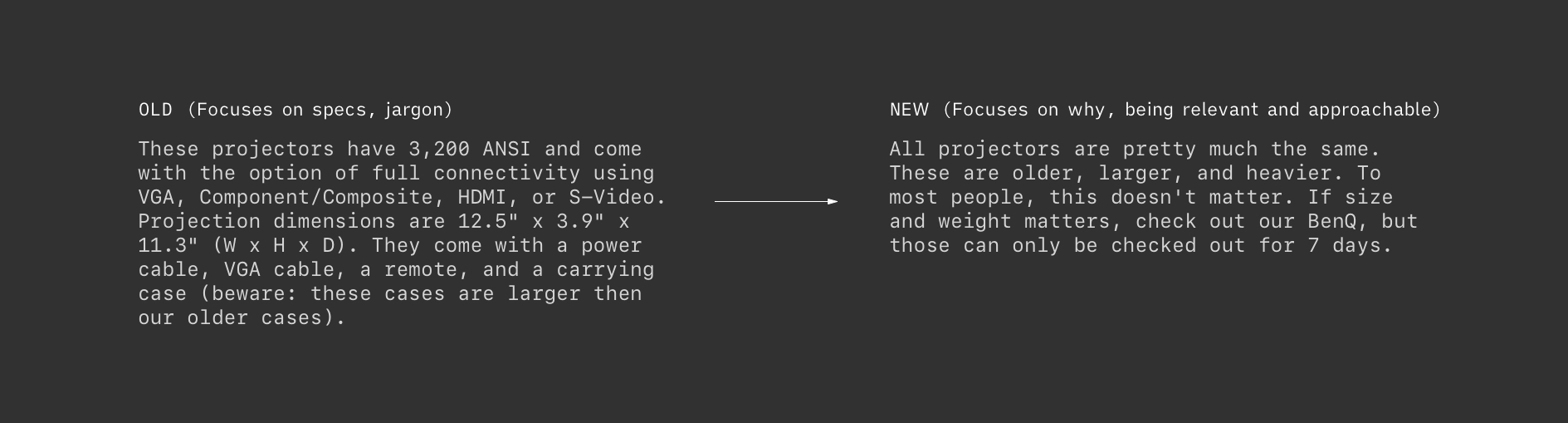
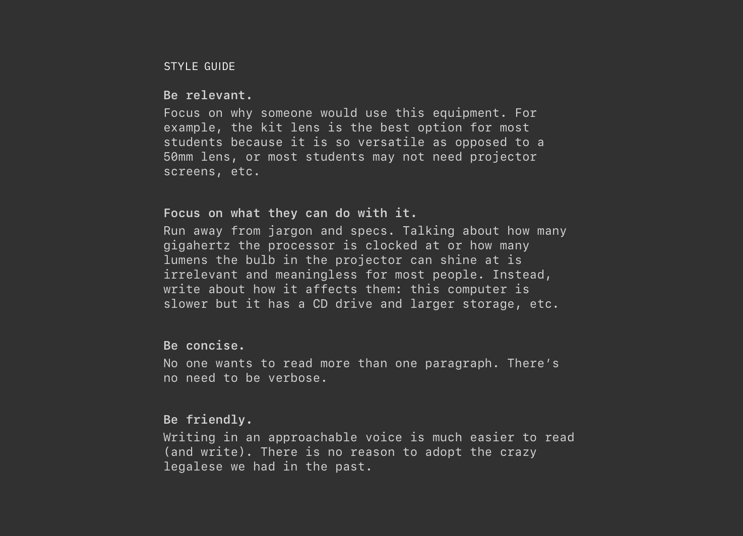
The descriptions for various equipment also needed an overhaul. These were re-written to remove all the tech specs and jargon, instead focusing on what each equipment does and why a student should choose it over something else.
Here, the “design” wasn’t going to fix everything. This was both a cultural and a content strategy problem.
All the text and equipment descriptions became bloated for a reason: our staff didn’t have any guidelines and took the easiest route, which was to write out tech specs in paragraph form. The result were descriptions that weren’t useful or relevant.
To fix this, I came up with a style guide. This way, there’s a framework for our staff to follow, incentivizing them to write something useful.
3. Reducing # of Support Calls and Emails
Making information easy to find and making all the text human-readable was a big step in reducing the volume of support calls and emails. However, there is another side to the equation.
We found that despite all improvements to the text, people are lazy. It was simply too easy to contact STLP, so a design solution I came up with was to add friction to the process.
Contact info is intentionally buried at the bottom of the FAQ page. This adds friction to the process, incentivizing students to go through the FAQ first before contacting support.
This was inspired by design patterns from companies like T-Mobile and has proved to be quite useful in eliminating unnecessary support correspondence. Friction is good!
4. Secure More Funding
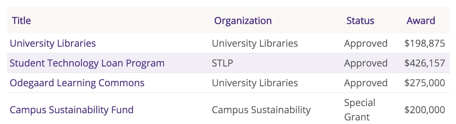
The last design goal was derived internally. Every year, STLP has to prove its value to the university to secure more funding. This process is burdensome and it’s obvious to us how we benefit students, it is harder to communicate that to the university.
The design goal was to find a way to showcase that students and clubs benefit quite a bit from STLP’s services.
I realized that students and clubs wanted publicity. Students want to show off the photos or videos that they take while clubs want more students to know about them. This was something that I could leverage since STLP’s website is visited by over 5000 students.
This manifested as background photos for the website’s header. The photo would be a photo that a student took and wanted to show off, or a club event that used STLP equipment. To them, this was free publicity. To us, this was a way to collect examples of STLP benefiting students and clubs.
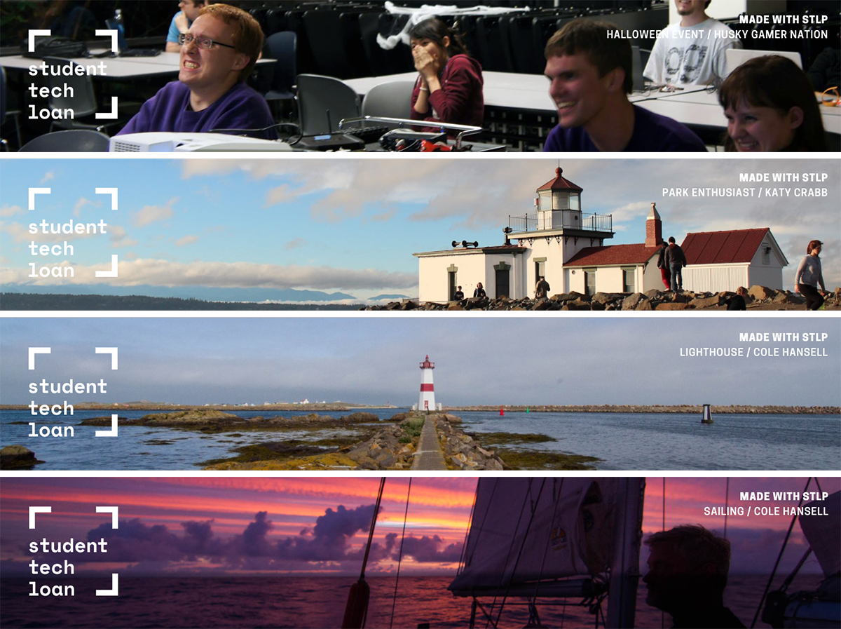
While there were certainly other factors, this design element played a part in helping STLP demonstrate its benefit and receive continued funding for many years.
Conclusion
This project was the most real and difficult project I’ve ever worked on. It was self-directed and there was no support infrastructure or resources. Everything that I designed had to be coded my coworker, and we had to mostly do it on our own time.
Additionally, unlike a classroom project, it actually had to “ship.” This meant we had to be scrappy and really focus on the things we could accomplish. In the end, the new web experience launched and was continually tweaked.
Given the lack of resources, I’m very proud of what we were able to accomplish and ship.
-
Development
Owen Flannigan
Nirawit Jittipairoj -
Design
Nirawit Jittipairoj